The Most Overlooked Room in the Building
Jul 1, 2025
")
Five projects honoring architectural heritage through elevator design.
by Joshua Nelson
There’s a quiet moment that happens inside an elevator, just after the doors close, just before the cab begins to move. In a well-designed cab — especially within a heritage building — that moment can be more than just a pause in a commuter’s day. It can be an opportunity to tell a story, to make a connection to the architecture, to the original mechanics of vertical transportation and the moment in history that gave the building life.
“Architecture is the printing-press of all ages, and gives a history of the state of the society in which it was erected …”
– Sydney, Lady Morgan
Most people don’t think twice about an elevator cab interior — but they should. It’s one of the few places in a building where everyone slows down, takes in their surroundings and feels the space up close. When designed thoughtfully, it tells you something about the building you’re in: its personality, its maintenance, even its history. It’s architectural design that you get to step inside of and feel come to life.
Designing within a heritage context isn’t just about nostalgia — it’s about precision. You often work with buildings that have seen a century or more of adaptation. Layers of poor renovations, design trends and code upgrades all collide in a tight vertical box, and the elevator cab sits right in the middle of that tension.
You are negotiating between code and character, between tenant expectations and architectural continuity. All of this happens in one of the most highly trafficked, scrutinized and technically constrained spaces in the building.
And that’s precisely what makes it so interesting. Because when it works, the result isn’t just a compliant elevator, it’s an experience that reinforces the property’s identity every single day.
This article shares five projects in Toronto, Ontario, Canada, where this historical appreciation takes shape in different ways: through restoration, reinterpretation and, in some cases, entirely new storytelling strategies. Each one is an attempt to treat the elevator cab not as an afterthought, but as a meaningful extension of the architecture itself.
10 Adelaide – The Birkbeck Building
Preservation as Precision
The Birkbeck Building at 10 Adelaide Street East is more than a piece of early 20th-century architecture; it’s a functioning time capsule. Designed in 1908 by George W. Gouinlock and now home to the Ontario Heritage Trust, the building’s original Otis-Fensom elevator stood as one of its most defining features. By the time we were brought in, it was still in use … but barely. Years of wear, mismatched materials and unsympathetic upgrades had left it stripped of character. What should have been a landmark was, in effect, a laminate box.
The restoration brief asked for more than an update. It asked for integrity. Working alongside heritage consultants, we completely removed the existing cab and fabricated a new one designed not just to meet modern standards, but to feel like it belonged back in 1908. The enclosure was rebuilt as a steel-framed panel system with expressed structure, hand-assembled with exposed rivets to emphasize craftsmanship and painted a custom-mixed heritage green, matched to the building’s original palette.
Every element was considered. The walls feature CNC cutouts, referencing architectural motifs from throughout the building, and, critically, the walls are open. Riders can now see into the elevator
shaft during travel, with lighting added to highlight the cables and motor, bringing attention to the mechanics that usually stay hidden and making the inner workings part of the visual experience.
Above, a custom-fabricated brass and copper dome ceiling was rolled and riveted by hand. A rare touch of metal craft that gave the cab a true bird-cage effect. Underfoot, we installed lightweight porcelain tile, inset with an original Otis medallion that anchors the floor with a touch of historic authenticity. Fixtures were just as carefully considered: The team restored the original manually operated Otis-Fensom car switch, rebuilt the brass floor indicator and reintroduced a fully functioning collapsible brass gate. A solid brass handrail completes the space with understated weight and warmth.
In 2019, this work received a Heritage Toronto Award of Merit for Building Conservation and Craftsmanship. It now operates not just as a piece of equipment but as a moving museum piece, a rare, working expression of industrial design brought into the present with passion and care.
manufactured by VDF Vertical
130 Spadina – The Reading Building
Theatrical Heritage, Reimagined
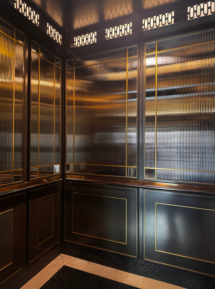
While some heritage cabs call for restoration, others demand reinvention, and how that reinvention is handled matters. At 130 Spadina, known as The Reading Building, we weren’t working with an original cab worth preserving. What remained was a tired, generic interior that didn’t reflect the building’s architecture, namesake or cultural value. Rather than defaulting to standard modernization, we got creative, using material, detail and illusion to create something more intentional and site-specific.
If Birkbeck was a museum piece, this project was theater: a new space designed to feel historic. We set out to echo the spirit of a turn-of-the-century birdcage elevator — not through replication, but through material restraint and visual storytelling.
That restraint was also practical. Elevator design comes with strict weight limits, which pushed us to engineer creatively. We used aluminum extrusions and water-jetted slabs, then powder-coated them to mimic the depth and warmth of aged brass and bronze. The result delivered the visual presence of heavy metalwork, without compromising performance.
Unlike Birkbeck, we weren’t able to cut into the enclosure. So instead, we created the illusion of transparency and movement using reeded Houdini glass and small corner mirrors. This pairing produced a layered, reflective effect that animated the space — not fully transparent, but always in motion.
Lighting played a similar role. Traditional upper-venting was reimagined as an illuminated feature: Cutouts backed with semi-opaque lenses created a soft cove light that defined the cab coupled with a classic ceiling-mounted lantern, which added a final point of focus.
And then there was the floor, often an afterthought, but not here. We mimicked the original terrazzo in the building’s lobby using lightweight ceramics, allowing for full visual continuity between public space and cab interior. It’s the kind of detail most riders won’t consciously notice, but they’ll feel it. This project wasn’t about preservation. It was about invention in the service of memory. The cab didn’t need to be original to feel appropriate; it needed to be well-crafted and spatially aligned with the tone of the building. And in that, it does what heritage design should: It respects the past without being limited by it.
1 Front Street – The Dominion Building
Memory in Material, Quietly Framed
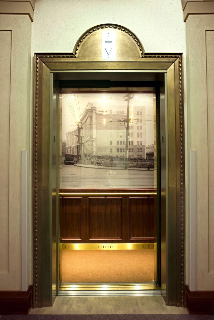
At 1 Front Street, the approach shifted again, not toward replication or illusion, but toward a quieter, more traditional sense of presence. The building itself, a stately example of early 20th-century commercial architecture, already held a strong identity. Our role wasn’t to dramatize it, but to draw a clear, elegant line from its past to its present.
Unlike the more theatrical tone at The Reading Building, the Dominion Building called for smething Canadian, a cab interior that felt rooted, composed and modestly formal. We began with proportion and material. The cab was rebuilt in rich wood veneer, detailed with classical mouldings. The palette was restrained but deliberate, warm wood panels detailed with classical mouldings, paired with solid brass handrails that add both weight and tactility. Together, they create a measured rhythm and material richness that echo the building’s old-world charm.
The most striking gesture, though, came in the form of imagery. Drawing from the Toronto Archives, we sourced historical photographs of the building and its surrounding streetscape from the early 1900s. The images were carefully scaled, touched-up and built into the cab interior — not as decoration, but as visual references to the building’s history. In a space usually seen as purely functional, they offer a clear reminder of the building’s past.
This cab doesn’t announce itself loudly. It’s not an act of preservation, nor a contemporary reinterpretation. Instead, it’s an architectural footnote — elevated — a space that informs like a gallery. For visitors and tenants alike, it offers a small, curated encounter with the building’s history, a moment of visual quiet that adds weight and context to a routine vertical trip.
119 Spadina – The Balfour Building
Layered Continuity: The Blueprint as Narrative
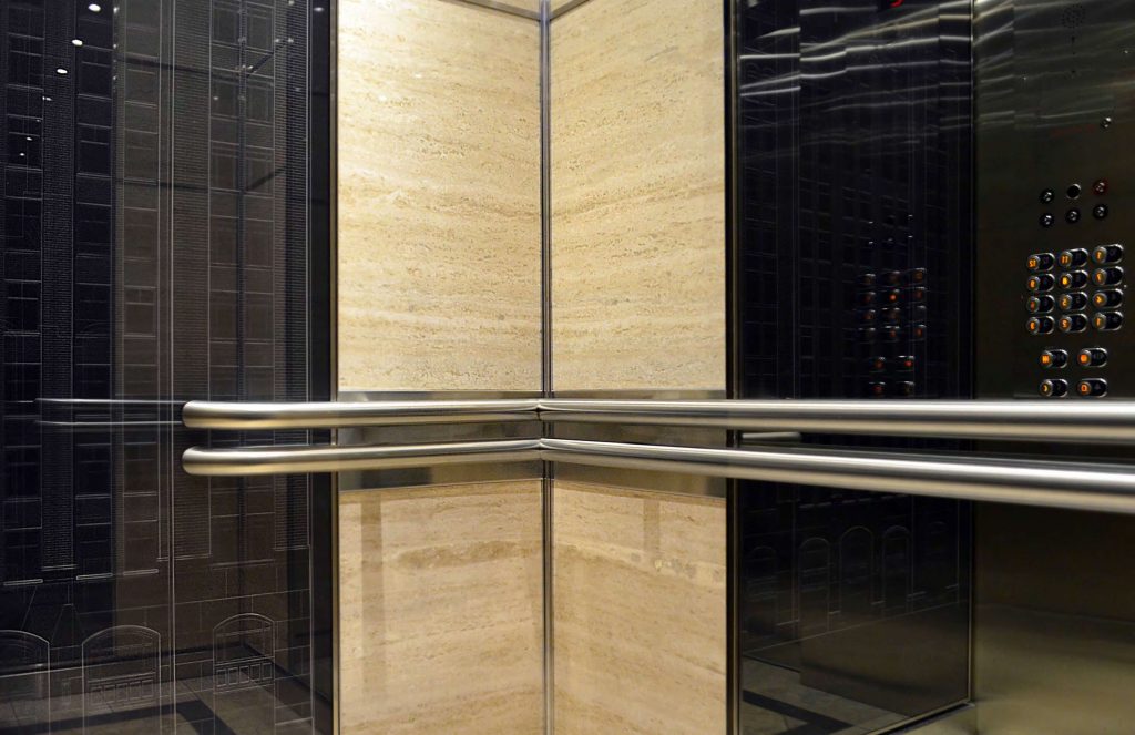
At 119 Spadina, the goal wasn’t to replicate the past or restore an original. Instead, it was about creating a clear connection between the elevator and the building’s existing material ecology — one that honored the building’s history while using contemporary design to meet the expectations of today’s office tenants.
The lobby of the Balfour Building features natural stone walls and floors, and that became the foundation of our design. We extended the material palette directly into the cab using lightweight, engineered natural stone that matched the look and feel of the lobby. The result is a seamless transition from the lobby into the elevator — a move that gives the cab visual consistency without drawing too much attention to itself.
The focal point of this cab is a custom graphic wall treatment based on recreated architectural blueprints of the building. Drawn by hand through site study and archival research, these linework compositions were digitally assembled and printed onto a durable wall surface. More than decoration, they serve as a direct visual link to the building’s original design — allowing users to see the full detail of the façade and architectural elements that might otherwise go unnoticed. It’s a way of celebrating the building’s character not just through material, but through drawing, observation and exposure. The result is beautiful, specific and expressive.
This project sits between conservation and contemporary design. It doesn’t lean on classical detailing or overt nostalgia, but it also doesn’t erase its context. It’s a transitional move, using design as a translator. It’s a modern solution, and designed to give users a moment of quiet appreciation as they move through their workday.
155 Yorkville – Residences of Yorkville Plaza
Contemporary Heritage Through Visual Storytelling
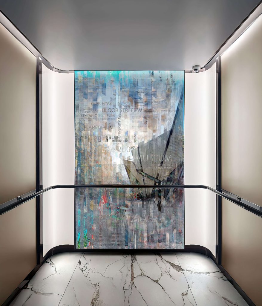
At 155 Yorkville — the former site of the original Four Seasons Hotel and a landmark of the neighborhood’s cultural evolution —the elevator cabs became a platform for a different kind of heritage. Not defined by preserved materials or historic mouldings, but by narrative and identity. Located in the heart of Yorkville, these cabs engage with the layered memory of a place known for bohemian culture, luxury retail and cinematic legacy.
Each of the five elevator interiors at the property features a unique, large-format art piece. These works combine archival photographs, contemporary imagery, collage techniques and digital layering to express Yorkville’s history. Thematically, each composition focuses on a different element of the neighborhood’s identity, from its roots as a hub of bohemian culture, to its transformation into a center of luxury retail and design, to its ongoing role as a place of gathering — through its public spaces, cafés and parkland — Yorkville’s layered identity is captured and reflected in each cab.
The result is a series of rich, abstract compositions where architecture, people and moments in time are layered, repeated and blurred — not to obscure meaning, but to reflect how history accumulates in place.
The collages aren’t simply mounted prints. They’re fully integrated into the cab interiors as custom-fabricated wall features, complemented by carefully designed lighting and concealed fixtures that allow the artwork to take center stage.
Every material decision, from minimal bronze trims to panel integration to hidden lighting, was made to reduce visual noise and elevate the clarity of the image.
Unlike previous projects in this series, this cab doesn’t lean on traditional detailing or direct architectural references. It’s entirely contemporary. The result is a space that doesn’t recreate the past — it curates it, using visual storytelling to connect residents and visitors with the layered life of the neighborhood in which they’re living.
Final Thoughts: Designing for Memory in Motion
Working on these elevator interiors showcases the way I think about heritage. As a designer, artist and researcher, I’ve always been drawn to the layered character of older buildings, but it’s through elevator cabs that I’ve learned how powerful a few square feet can be. These aren’t just transitional spaces. They’re moments where people engage with a building directly, quietly and often. And that makes them meaningful.
Each project in this series has required a different response, some grounded in preservation, others built through interpretation, invention or narrative. But all of them were driven by the same question: How can design carry forward what a building stands for — not just physically, but culturally?
In a field where modernization often means erasure, I see elevator cabs as a place to slow down, look closer and tell the story well, and not through nostalgia, but through care. That might mean hand-riveted steel or a reimagined lighting detail, a restored brass gate or a digitally layered art piece. In the end, it’s about intention, and trusting that even in a space as small as an elevator, that intention matters.
Get more of Elevator World. Sign up for our free e-newsletter.
![]()


")

![]()