A property co-op board member collaborates with elevator companies and other suppliers to realize an impressive transformation.
Native New Yorker Hal Jannen has been involved in art and design ever since he was growing up in Queens in the late 1970s and early 80s. He attended the prestigious High School of Art and Design in Manhattan, progressing to New York University (where he studied liberal arts and served as a deejay on the college radio station), Parsons School of Design and then New York Institute of Technology. His more than 20-year career saw him designing a broad range of print collateral (ads, brochures, posters and logos) for clients in theater, the performing arts — and later — in educational publishing. Volunteer work included serving as mentor and after-school tutor for children at community centers throughout NYC, as well as consistently being an active board member of the Kensington House Owners Corp., a residential cooperative (co-op) at 200 West 20th Street in Chelsea, a vibrant neighborhood in Manhattan. Opened in 1938, the 14-story apartment building, designed by famed architect Emery Roth, became a co-op in 1986. Despite never having worked on an elevator design project before, Jannen took the lead in transforming the property’s pair of elevators from nondescript, functional conveyances to spaces full of high-end ambiance that draw compliments from residents and visitors alike. Jannen (HJ), who worked with United Vertical Group (UVG), Century Elevator and other suppliers on the project, took the time to speak with your author (KW) about the experience.
KW: Tell me when and how this project originated and when and how you became part of it.
HJ: This project started back in January 2021. It came about because we needed to replace our aging elevators, which hadn’t been updated in more than 20 years. At the time, I was on the board of the Kensington House Owners co-op and took a very active role. I was involved with every aspect of this project, both as designer and project manager for the co-op.
KW: What was the time frame of this project from contract to handover, and did the pandemic affect it?
HJ: From the time we met with UVG in January 2021 to when the cabs were installed and finally operational, it was close to three years. There were other vendors, like Century Elevator, that oversaw all the mechanical and electrical component installation, and Monitor Elevator Products fabricated the button panels, lanterns and hallway call stations. Midtown Terrazzo was responsible for the custom terrazzo floors. This all had to be coordinated during the height of the pandemic. Supply-chain issues, COVID infections, schedules and other variables caused delays, but once we finally arrived at a start date, the elevators took approximately 10 months to be completed.
KW: How different are the “before” interiors to the “after?”
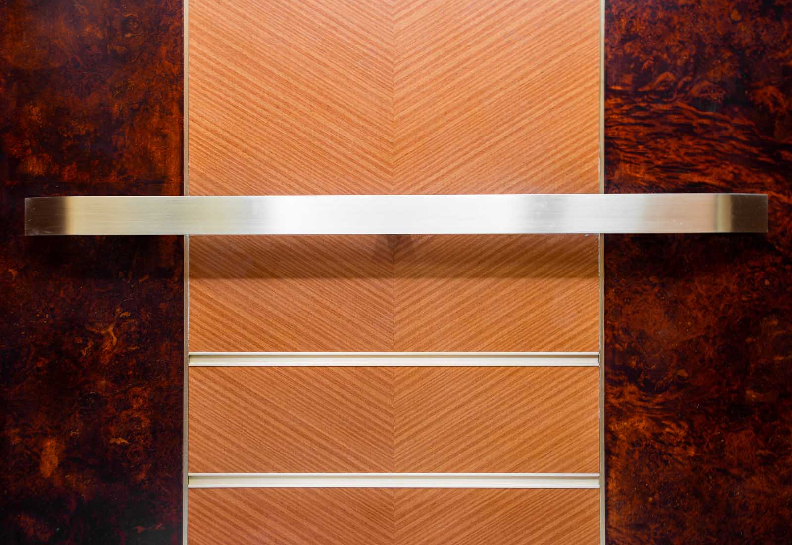
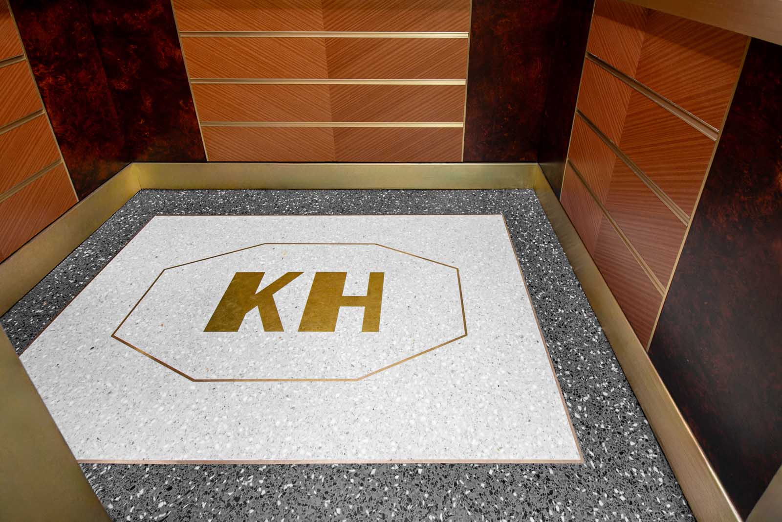
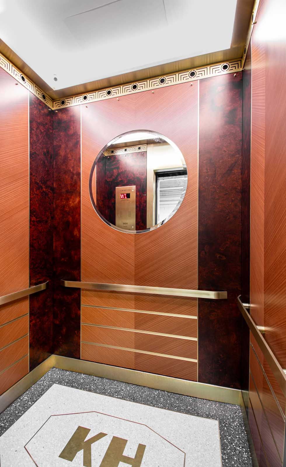
HJ: I worked closely with the board president who, like myself, loves Art Deco design and the architecture of Emory Roth. The previous elevators were clad with plastic wood laminate done in a vaguely Art Deco pattern that looked very worn and dated. I knew I wanted an elegant, modern interior that blended elements of Art Deco style with references to the materials used throughout the lobby that would complement the design heritage of the building. Borrowing from Art Deco furniture, the architectural features of the building and other pre-war Art Deco buildings I visited, I came up with a design scheme that combined different types of wood veneers, metal and glass. The walls are lined with oak burl panels stained a deep reddish brown that bookend panels of mahogany laid down in a chevron pattern. A large round beveled mirror is prominently featured in the middle panel. Muntz metal, which is a brass alloy, clads the door and transom, and a trio of evenly spaced, horizontal u-channels that sit just below the handrails wraps around the interior.
A valance just below the ceiling conceals perimeter lighting. This creates soft, diffused lighting inside the cab. Below the light valance is a custom-designed grille that finishes off the wood panels like the decorative friezes you see at the tops of many pre-war buildings. The pattern was cut using a CO2 laser.
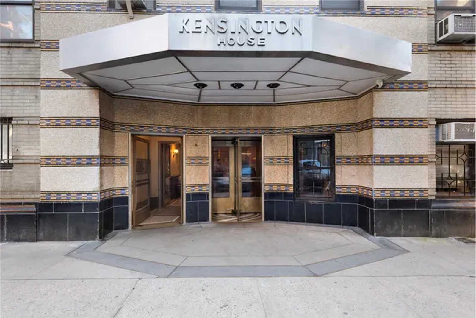
I knew I wanted an elegant, modern interior that blended elements of Art Deco style with references to the materials used throughout the lobby that would complement the design heritage of the building.
Designer Hal Jannen
KW: Tell me about the terrazzo floors with the custom “KH.” I think this is my favorite aspect of it. From where did you draw inspiration for this design?
HJ: The inspiration for the “KH” and elongated octagon came from the entrance to the building. This unique octagonal shape can be seen in the canopy overhanging the doors and in the tinted cement below. I designed this into the floors because I wanted every aspect of the interior to feel custom — unlike any other elevator. It’s a brand mark for the building.
KW: Had you ever done any similar (elevator cab design) projects before? Regardless, what did you like/find challenging or different about it?
HJ: This was the first time I had ever done a project of this kind, and I had never worked with vendors within the elevator industry before. But, like any design project I ever worked on, it was an opportunity to learn something new. I came away with a lot more insight into what makes an elevator run with all the mechanical and electrical systems that need to be integrated into a compact space.
KW: How do you feel about the end result?
HJ: Overall, I am very happy with the result, as are many of the residents and visitors to the building. They think the design is elegant, classic and timeless. When I get such positive feedback, I know that all of the work that I put into this project was worth it.
Get more of Elevator World. Sign up for our free e-newsletter.
