Elevator Planning Guidelines in the Early 1890s
Sep 1, 2022

Your author looks at what was important — and what wasn’t — in the early 1890s.
The 1890s witnessed the development of the first standards for determining the required number of elevators, their size and their operational characteristics (including speed, round trip time, etc.). An important parallel effort was the development of architectural guidelines that provided information on elevator placement, arrangement and lobbies or passenger waiting areas. Elevators were seen as critical components of a comprehensive set of planning standards used in the design of tall office buildings. Thus, vertical transportation (VT) design was considered in the context of other building systems, as well as a diverse set of general planning considerations predicated on producing commercially viable buildings.
New York consulting engineer George Hill was one of the first to propose a comprehensive set of office building design standards. These appeared in mid-1893 in an article published in Architectural Record: “Some Practical Limiting Conditions in the Design of the Modern Office Building.”[1] In typical engineering fashion, Hill approached his task as a “problem” to be solved, and he divided his standards into seven categories:
- Ease of access
- Good light
- Good service
- Pleasing environment and approaches
- The maximum of rentable area consistent with true economy
- Ease of rearrangement to suit tenants
- Minimum of cost consistent with true economy[1]
The fact that “ease of access,” a decidedly spatial and, perhaps, more architectural concern, was listed first served to immediately identify the elevator as a critical component. In fact, Hill stated that “the solution” of the modern office building problem “depends on them almost entirely.”[1]
The first item addressed was elevator placement: “We would state that the elevators must be placed so as to be reached directly from the street and only a few steps above or below the level of the sidewalk.”[1] While the idea that access to a building from the sidewalk would not be at grade level and would require using steps may seem odd today, it was a common feature of 19th century office buildings. Hill’s recommendation, based on increasing ease of access, sought to change a common design feature. Many office buildings in New York featured a basement level that was raised approximately one-half story above grade. Thus, from the sidewalk, a visitor reached the basement by going down a short stairway, and they reached the first floor by ascending a stairway that led to the main entrance hall. This strategy allowed light into the basement level and provided two floors that were relatively easily accessible from the sidewalk, which increased the building’s potential rental income. Hill was one of the first to recognize that this system presented an impediment to many building users.
An additional aspect of elevator placement was grouping: “We would state that all of the elevators should be grouped together,” they “should be so placed as to bring them about equidistant from the extreme offices,” and, “as a corollary of this, all of the elevators should be so placed as to be readily seen by a person standing in the middle of the space devoted to them.”[1] Hill strongly advised against, even in the case of a large building, using a “double set” of elevators, where the decision was often based “on the supposition that at least half of the tenants would use one set while the general public would use the other.”[1] He believed such an arrangement would cause confusion with the constant need to direct visitors to the proper set of elevators. In typical 19th century fashion, he claimed that: “The time-saving device that requires a guide book to call attention to it is of but little value.”[1]
Hill stated that a 5’ x 5’ car, operating at 450 ft/min provided “good satisfaction … for ordinary service.”[1] In buildings that had more than 20 offices per floor, he recommended that 1 ft2 of area be added to the cars for each additional office until the size reached 6’ x 6’, after which “the number of cars should be increased.”[1] The suggested capacity was defined as a live load of 2500 lb carried at maximum speed. The elevator well or shaft “should be made one foot larger in each dimension than the size of the car … and, of course, must run through plumb and true.”[1] He recommended that the ground floor hallway leading to the elevators have a width of 8 ft, and that the space in front of the elevators be equal to the well size. On the upper floors, the suggested hallway width was 3 ft 8 in., with a 4-ft-wide space in front of the elevators. While Hill’s descriptions implied the presence of a hallway and an elevator lobby, the schematic plans he provided that illustrated his design guidelines reveal that he often saw the hallway as capable of simultaneously serving as a passageway and a lobby space.
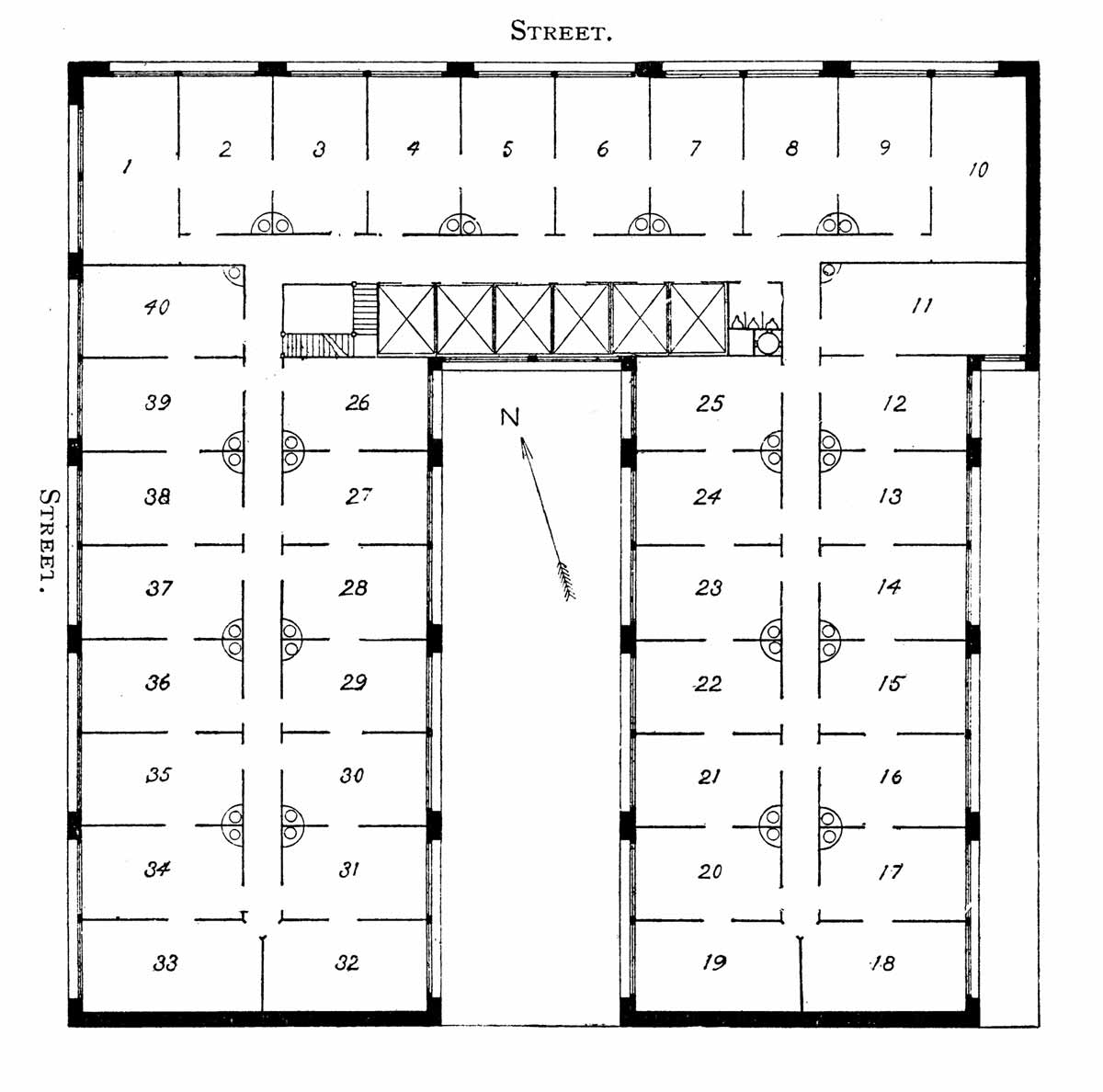
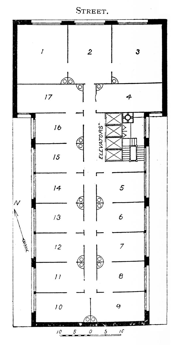
He provided plans for three generic sites: 25’ x 100’, 50’ x 100’ and 100’ x 100’. In each case, he depicted a building on a corner and an inter-block site in order to illustrate the proper location of light courts. The plans proposed for the 25’ x 100’ site included an awkward “bump” in the hallway as it passed around the elevators, which served as the lobby (Figure 1). The plans for the 50’ x 100’ site featured an expansion of the hallway adjacent to the elevators such that the design appears to follow the guideline of the lobby space being equal to that of the well (Figure 2). The plan for the 100’ x 100’ site simply employed a slightly wider hallway intended to accommodate waiting passengers and workers moving between offices (Figure 3). In each plan, the elevators were placed in a straight line with the number ranging from two to six elevators in length. The latter arrangement, placed along a relatively narrow hallway, would have made it difficult to spot the first available car.

While Hill’s design guidelines for tall office buildings provide a useful lens through which to understand attitudes toward elevatoring in the early 1890s, as with all such guidelines, their abstract presentation makes it difficult to assess their relationship to actual building practice. However, in a three-part series that immediately followed the publication of Hill’s article, Architectural Record evaluated the success of three recently completed buildings using his criteria as the primary assessment tool. While the series’ author was not identified, the magazine described the articles as part of a broader editorial strategy:
“The Architectural Record intends to add to its series of critiques on current architectural practice, which treat of peculiarities, eccentricities, or worse in the façades of buildings, a series which shall deal with the plans of office buildings, calling attention to defects which exist in them and showing the consequences thereof.”[2]
The series on office building plans was titled “Wasted Opportunities,” which represented a somewhat softer approach than was applied to their series critiquing façade designs, which was titled “Architectural Aberrations.”
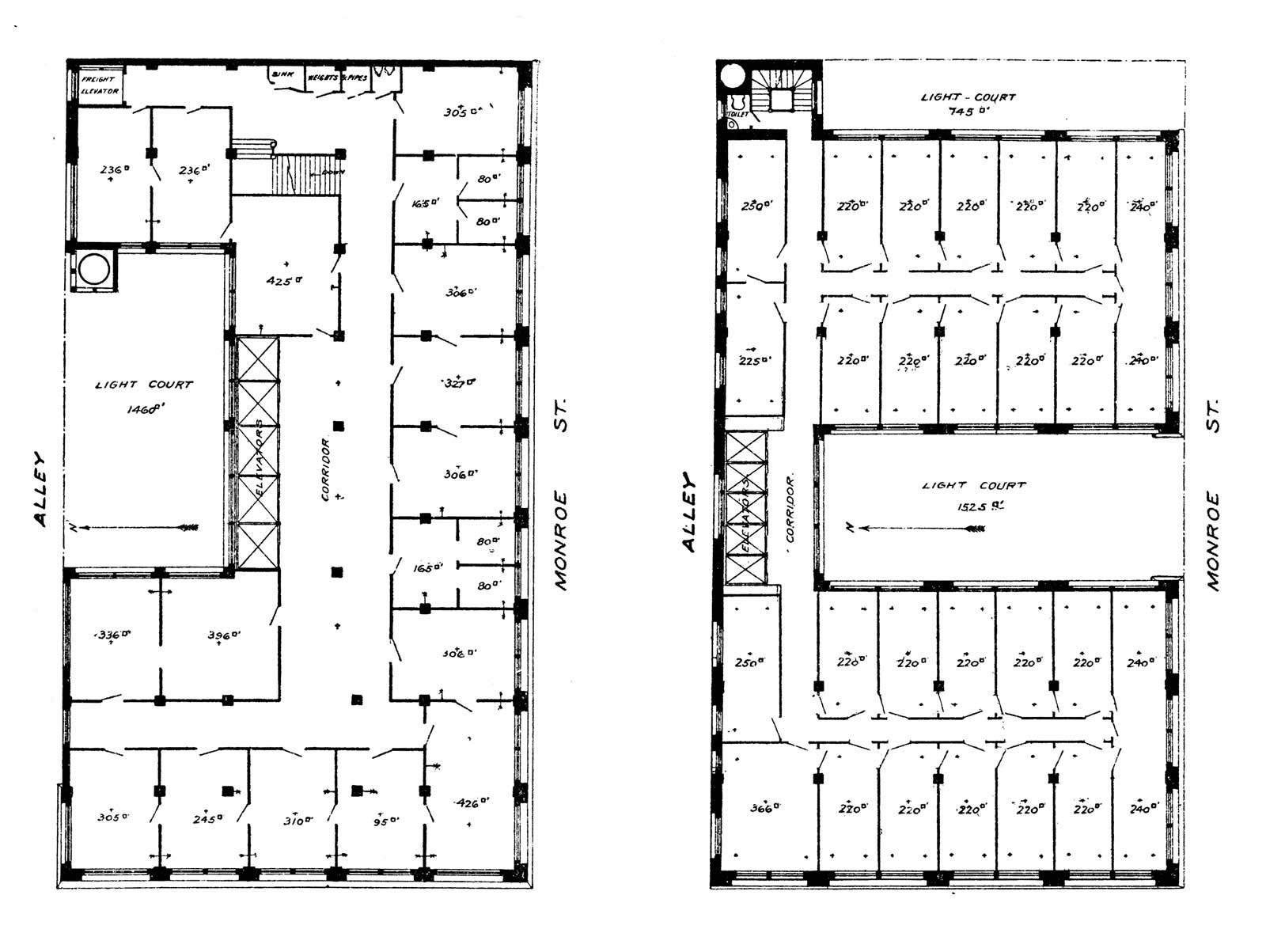
The first article in the series examined the Chicago Title and Trust Company Building, designed by Henry Ives Cobb and located in Chicago. This article established the format used in the series, which included a typical upper floor plan of the building as built and a revised plan that followed Hill’s guidelines (Figure 4). The revised plan was intended to highlight the “wasted opportunities” found in the actual plan. The criticism of the placement of the elevators in Cobb’s plan focused on one primary issue, ease of access: “A person entering the space devoted to elevators in the executed building has to risk the dislocation of his neck in order to see which elevator will most quickly serve him.”[2] The design was also perceived as one that would “cause confusion and interference at times, especially when the attempt is made to use the two corner elevators simultaneously.”[2] And, the size of the elevator lobby was deemed to be too large. The revised plan, which followed Hill’s suggested approach to elevatoring, was preferred because “all of the elevators are visible at a glance” and the floor area allocated to the elevator lobby was reduced from 288 ft2 to 221 ft2.[2] Lastly, the number of elevators was reduced from seven to six, which would have resulted in a significant cost savings.
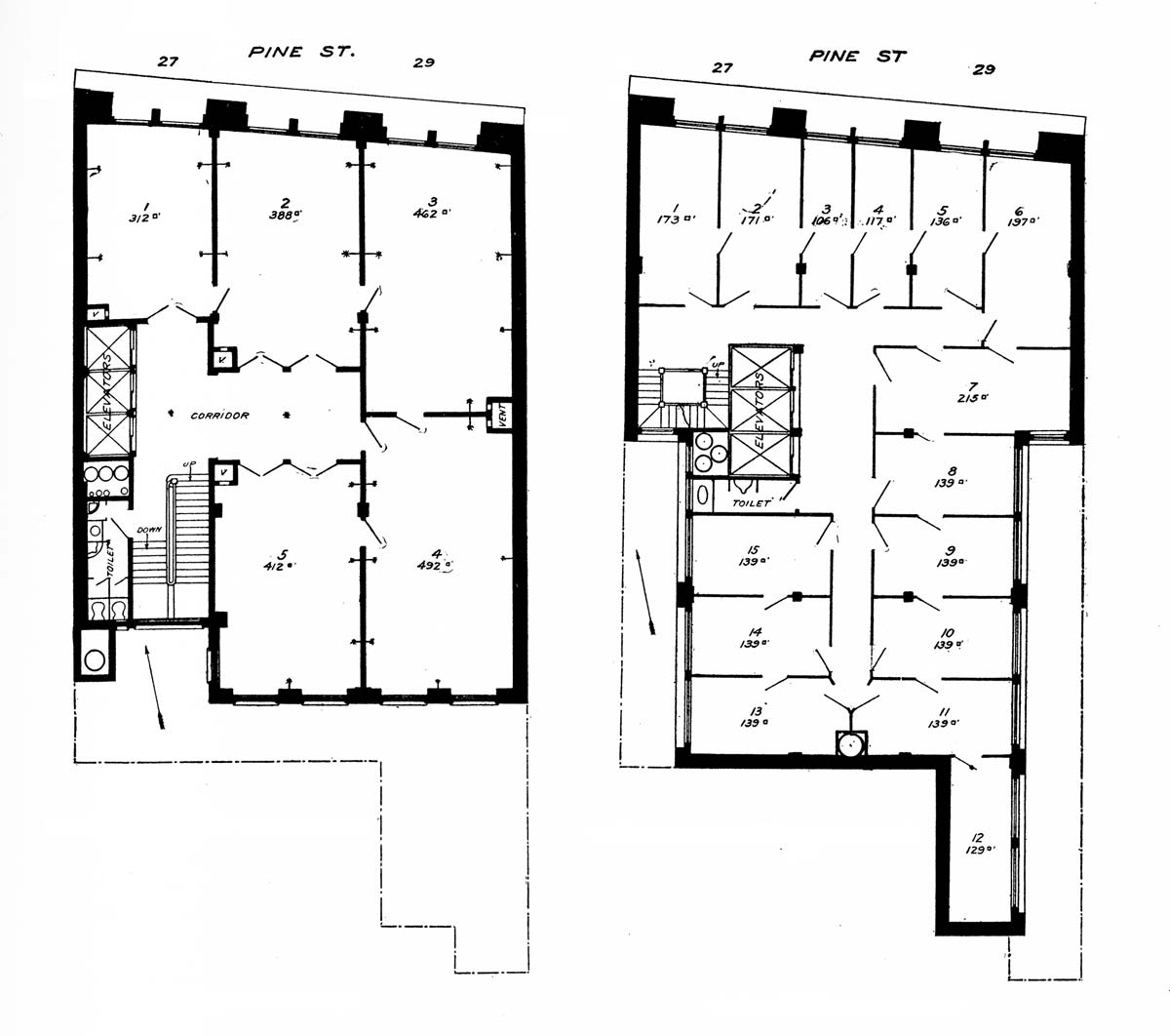
The second article in the series critiqued the Loeb Building, located in New York and designed by Theodore W.E. De Lemos and August W. Cordes (Figure 5). In this instance the only issue with the elevator placement was their impact on admitting light into the building:
“The position of the elevators in the two plans will be seen to be practically the same; the difference being that in one case they are moved out from the wall so as to admit light past them into the hallway, and in the other case are backed up against the wall … In the plan, as it should be, the stairs are at the north end of the court, with windows on two sides, admitting light directly into the elevator shaft and halls and reflecting from the walls of the offices also into the halls, so that they would always have a bright effect.”[3]
While the lighting goal is reasonable, even if the shafts were equipped with the typical open wire-work enclosures of the period, it is difficult to gauge how much additional light would have actually entered the building in the revised plan. The most interesting aspect of this critique was the recognition that the space required for the vertical hydraulic elevator engines (illustrated in the plans by the circles found in the chase adjacent to the cars) could have been eliminated if electric elevators had been used. This represented one of the earliest instances of an author advocating for the use of electric elevators in an office building.
The fact that “ease of access,” a decidedly spatial and, perhaps, more architectural concern, was listed first served to immediately identify the elevator as a critical component. In fact, Hill stated that “the solution” of the modern office building problem “depends on them almost entirely.
The third and final article examined the New York Life Insurance Building, located in Chicago and designed by William Le Baron Jenney (Figure 6). The primary issues addressed by the revised plan concerned the design of the light court, office planning and the elevator lobby. The latter was reduced in size (following Hill’s guidelines), and the cars were also made smaller. The revised plan also eliminated the freight elevator, which was perceived as “a fixture wholly unnecessary in an office building.”[4] If a separate freight elevator was perceived as necessary, its suggested location was the well of the stair found at northern end of the revised plan. The importance of the stair, and its role in facilitating vertical movement in an office building, was also touched on in this critique. Jenney’s original plan included a public stair for building users, while the revised plan suggests using a smaller and somewhat isolated stair. The article’s author viewed the public stair as an outdated feature; because the stairs were “simply to act as a relief in the event of a breakdown of the elevator plant, and therefore to be called but occasionally into use, their position is one of little importance.”[4] This statement implies a clear preference for using elevators instead of stairs (why climb when you could ride?) and hints at a future where fire stairs occupied discrete spaces seemingly unconnected to primary paths of movement.
Although the history of elevator placement is one that has been touched on in past articles, it remains a largely unexplored topic. Future explorations into this material will include continued examinations of buildings in the U.S. and, of equal importance, examinations of elevator placements in Europe, Asia and elsewhere. Future explorations will also extend this study to include the placement of elevators on the first or entrance floor. This critical aspect of elevatoring, which constitutes a user’s introduction to a building’s VT system, is also a topic that deserves more investigation.
References
[1] George Hill, “Some Practical Limiting Conditions in the Design of the Modern Office Building,” Architectural Record (April-June 1893).
[2] “Wasted Opportunities I,” Architectural Record (July-September 1893).
[3] “Wasted Opportunities II,” Architectural Record (October-December 1893).
[4] “Wasted Opportunities III,” Architectural Record (April-June 1894).
Get more of Elevator World. Sign up for our free e-newsletter.


