Elevators Improved in User Friendliness and Comfortability
Oct 1, 2017
How a modification was designed to provide greater accessibility and convenience for all
This paper was presented at  Madrid 2016, the International Congress on Vertical Transportation Technologies, and first published in IAEE book Elevator Technology 21, edited by A. Lustig. It is a reprint with permission from the International Association of Elevator Engineers
  (website: www.elevcon.com).
by Chie Nomaguchi, Kyoichi Ikeda, Hidekazu Nishimura and Hideki Tsuboi
Today, the concept of universal design in public facilities has spread worldwide. Society desires elevators designed under this concept. Some users with access difficulties, however, might feel inconvenience accessing operation panels. To improve convenience, we have modified our standard model SPACEL-GR on the state-of-the-art universal design concept and realized the optimal arrangement of operation panels and handrails in cars. We built a mockup cage with capacity for two wheelchairs and positioned the operation panels within users’ reach, then verified and reviewed user friendliness and comfortability. This paper presents a summary of the design process.
1. Introduction
In recent years, the concept of using universal design in public facilities has spread, and many of these concepts have also been adopted in elevator design. In Japan, the movement to give disabled people more rights has gained momentum, and Japan ratified the international “Convention on the Rights of Persons with Disabilities” on January 20, 2014. Furthermore, with the upcoming Tokyo Olympic and Paralympic Games in 2020, there is a demand for Japan to provide reasonable accommodation to people with disabilities, as well as generally improve convenience for all users, regardless of age or gender.
In the midst of these changes, Toshiba Elevator has been actively applying the concept of universal design to its elevator designs. Toshiba has two major concepts of universal design: user friendliness and comfortability. User friendliness aims to remove the access and use difficulties for every user. Comfortability aims to remove the sense of unease and stress for every user.
So far, various opinions have been reflected in our products to primarily improve accessibility. This time, focusing particularly on wheelchair users, we developed the newly designed operation panel with user friendliness and comfortability in mind, and placed it in the most suitable position.
To verify the effectiveness of the new design, several post-design prototype tests and reviews were performed with impaired users’ full cooperation. We give special thanks to these participants. This paper is an account of these improvements.
2. Examples of the Application of Universal Design and Further Issues
Thus far, with a view to improving user friendliness, we have interviewed people with disabilities, and they have tested our products, so we have been able to release products that meet the actual needs of users. Furthermore, in terms of improving comfortability, we have made further improvements to safety and released products that also reduce psychological anxiety.
2.1 Application Examples
In 2003, we started using raised lettering on the elevator buttons. This helps visually impaired people who cannot read Braille by enabling them to feel the numbers on the buttons. We tested several versions of the raised lettering and decided to use bold characters with thin raised sections to make them easy to feel and read, for both sighted people and those with weak eyesight.
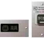
In 2005, we developed and released some options for those with impaired hearing. These were created as a result of interviews. One of these was a “fully occupied” sign. Normally, a buzzer sounds when the elevator is full, but the “fully occupied” sign, located on the back wall of the car, lights up to alert users that the car is full. Another is a “leaving-the-elevator” (“coming-through”) notification button. When a user presses this button, an announcement saying, “A passenger is leaving the elevator. Please clear the way,” is played so they can leave the car easily.
In 2009, we added an LCD indicator to the car operation panel. The screen was designed so that it is not affected by differences in color perception, so it is easy for many people to see.
Until now, we have improved the accessibility of elevators through tests with people with impaired vision or hearing. However, for wheelchair users, we had only designed elevators following conventional design standards. Thus, considering convenience for users, we decided to confirm how useful they are and make further improvements.
2.2 Fieldwork and Results
We used wheelchairs ourselves and carried out fieldwork in which we used the elevators in universities and stations to find out what using an elevator was actually like for wheelchair users. From this fieldwork, we discovered the following issues:
- Observation elevators had small mirrors, so it was not possible to look in a mirror while reversing out of the elevator.
- In a narrow elevator hall, the hall button was in the corner, and it was difficult to reach with a wheelchair.
- The side wall of the car was divided in two, and the operation panel for wheelchair users was located on the rear side wall. The feet of the wheelchair user hit the back wall, and it was not possible to operate the panel.
From this fieldwork, we found that even elevators with special equipment installed were not necessarily easy for wheelchair users to use, depending on the size or placement of the equipment. To make it easy for everyone to use this equipment, the whole car system, not just the equipment itself, needs to be optimized. We are aiming to tackle these problems through testing and experiments, so we can provide elevators with improved usability for wheelchair users that are also designed with consideration for other users.
3. Testing With Wheelchair Users and Application of Results in Station Elevators
3.1 Features of Station Elevators
Stations, used by many people (including wheelchair users), are among facilities with the greatest need for application of universal design. Station elevators are mainly used to travel between the platform and concourse, and have the following features:
- Most stop at only two floors (platform and concourse).
- They have entrances at both ends.
- The cars are narrow (due to limited platform space): an 11-passenger car is 1,000 mm wide and 1,850 mm deep, and a 15-passenger car is 1,000 mm wide and 2,400 mm deep.
- The operation panels are located on the side wall.
3.2 Elevator Use Case
We tested the station elevators with the following actions, in order, to identify any issues:
- Approach the elevator.
- Press the button.
- Wait for the elevator.
- The doors open.
- Get on the elevator.
- Approach the car operating panel
- Press the button for the destination floor.
- Wait until the elevator arrives at the floor.
- The elevator arrives at the destination floor.
- The doors open.
- Leave the elevator.
For steps 1 to 3, an elevator is normally located in a relatively spacious concourse in a station, so passengers can easily access it. In relation to steps 4, 5, 10 and 11, many station elevators have one entrance at each end, so passengers leave the elevator from the opposite door to the one from which they entered. Entering and leaving the elevator is a relatively smooth process, as there is no need to turn around or reverse out of the elevator.
Of all the steps, the ones that are important when using a wheelchair are 6 and 7. If wheelchair users cannot use the buttons in the car when riding the elevator alone, not only can they not reach their destination floor, but they may also not be able to leave if the doors close. When we interviewed wheelchair users about using elevators, many told us this makes them anxious.
To make steps 6 and 7 possible, we tested the height of the buttons and the depth of the location of the operation panel. We considered the height at which button operation is possible for wheelchair users, including those whose arms have a small range of motion, and the depth at which the buttons should be located so that the wheelchair does not hit the side wall or door, making it difficult to approach the buttons.
3.3 Testing the Optimal Button Placement for Wheelchair Users
3.3.1 Height
When designing the station elevator, we analyzed the usability of the current operation panel for wheelchair users.
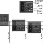
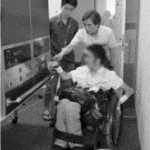
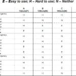
We used an electric wheelchair that conforms to Japan’s JIS standards for the tests. There were four test subjects, with heights of 152 cm (female), 158 cm (male), 165 cm (male) and 186 cm (male). They evaluated how easy it is to operate the buttons with their elbows on the armrest of the wheelchair. We tested button heights (hb) with the lower buttons at 1,000 (current height), 850 and 800 mm from the floor. The results are shown in Table 1.
When hb = 1,000 mm, the open/close button (920 mm from the floor) was rated “easy to use” by three subjects. When hb = 850 mm, the upper number buttons were rated “easy to use” by three subjects. When hb = 800 mm, the emergency call button was rated “easy to use” by two subjects and “neither” by two subjects. From these results, we found that the buttons were rated “easy to use” when at a height of around 900 mm, regardless of the height of the operation panel. For the emergency call button, when hb = 1,000 mm (the emergency button is 1,170 mm from the floor), three subjects rated it as “hard to use,” and when hb = 850 mm (the emergency button is 1,020 mm from the floor), two subjects rated it as “neither” and one as “hard to use.” From these results, we found that buttons can be operated when placed between 900 and 1,100 mm from the floor. However, buttons positioned lower than the armrest could not be operated, as movement below the armrest is limited. For buttons positioned above reach when the subject’s forearm is raised with their elbow on the armrest, operation may not be possible, depending on the level of disability.
From these results, we determined that the position at which buttons can be operated is between 900 and 1,100 mm from the floor, which is approximately the same as the circumference of forearm movement around the elbow. We also determined that the easiest to use button height is 900 mm.
3.3.2 Horizontal Direction
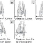
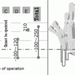
Next, we tested the horizontal range in which operation is possible for wheelchair users. We tested the range in which the buttons could be operated with elbows resting on the armrest when at a height of 900 mm. In the measurements, the center of the wheelchair wheel is 0, the area in front is positive, and the area behind is negative. As the range in which operation is possible differs according to the distance and angle between the operation panel and wheelchair, we tested operability in five positions (Figure 6): first with distances of 400 mm (A), 500 mm (B) and 600 mm (C) between the operation panel and wheelchair, then with legs angled toward (D) and away from (E) the operation panel.
The results are shown in Figure 7. As the results for A to C show, operating buttons in front becomes more difficult as distance from the operation panel increases. As the results for D and E show, operating buttons behind becomes easier with legs angled toward the operation panel (D), and operating buttons in front becomes easier with legs angled away (E).
When we compiled the results, we found that the range in which operation is possible for wheelchair users is -100 to 250 mm.
3.3.3 Horizontal Placement in the Car
Fifteen-passenger elevators are deep enough that two wheelchair users can ride the elevator at the same time. If the operation panel is placed in the center of the side wall, it can be operated when one, but not two, wheelchair users are in the elevator.
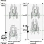
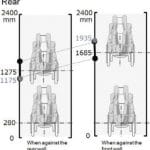
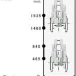
Initially, as shown in Figure 8, when two wheelchair users are in the car, and the wheelchair near “Front” is against the rear wall, the movement range of the center of the wheelchair’s wheel near “Front” is 280-690 mm when the front wall of the car is 0 mm. When combined with the range found in 3.3.2, the range in which buttons can be operated is 180-940 mm. Next, as shown in Figure 9, the movement range of the wheelchair near “Rear” is 1,275-1,685 mm, and the range in which buttons can be operated is 1,175-1,935 mm. The ranges in which operation is possible for two wheelchair users are 180-940 mm and 1,175-1,935 mm. As these do not overlap, operation panels are needed in at least two places so two wheelchair users can use the elevator simultaneously.
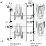
As there are entrances at both ends, we then tested the range when the elevator is boarded from “Rear.” When boarded from “Rear,” the range in which operation is possible is 1,460-2,220 mm for the person near “Rear” and 465-1,225 mm for the person near “Front” (Figure 10). This is the inverse of when boarded from “Front.” The combined range in which operation is possible when boarded from “Front” or “Rear” is 465-940 mm for the wheelchair near “Front” and 1,460-1,935 mm for the wheelchair near “Rear.”
3.4. Application in Station Elevators
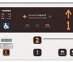
We used the experience we gained from this testing to decide on the button layout of the operation panel and panel placement in the car. Figure 12 shows the operation panel. The most important factor in operating the elevator is the button layout. Based on what we learned from the wheelchair user tests, we set a height of 900-1,100 mm from the floor and placed many buttons around the 900-mm height, where they are easiest to operate. We placed the interphone around 1,000 mm from the floor, which is almost the same height as the typical wheelchair user’s face.
Furthermore, we grouped the buttons by function to prevent incorrect usage for all users, including standing and visually impaired users. We considered the low line of vision of children and wheelchair users and the high line of vision of other users, and placed the indicator and display segment that shows which doors will open above the operation panel.
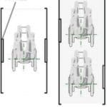
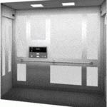
Figure 13 shows the placement of the operating panel in the car. Eleven-passenger elevators are not deep, so we placed the operating panel in the middle of the side wall as in Figure 12. For 15-passenger elevators, we placed panels on two different walls so they are in the areas found in 3.3.3. This placement makes the operation panel easy to access for non-wheelchair, as well as wheelchair users, whether they board from the front or rear, and we expect this to improve usability.
We carried out user testing of the new control panel and a prototype car that incorporates the new panel.
3.5 Testing the Prototype
The testing confirmed that the buttons were in a range that could be operated by wheelchair users by hand or by using a tool to extend reach, and that the indicator was near the height of wheelchair users’ faces and could be seen without changing their line of view. The height of the interphone also made it seem easy to use.
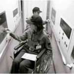
The tests also confirmed that the positions of the operation panels allowed them to be operated when two wheelchair users boarded the 15-passenger car. Furthermore, moving the operation panels made them easy to use for non-wheelchair users near the entrance/exit, when compared to having the operation panel in the center.
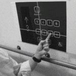
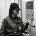
Unfortunately, lowering the buttons meant that wheelchair users need to operate the buttons over the handrail in front of the operation panel, and the handrail impeded operation. By placing the handrail slightly closer to the side wall, we were able to improve operability, while maintaining the functionality of the handrail.
For visually impaired users, the lower buttons below eye height can be seen by bending down. Furthermore, we received feedback saying that low-contrast buttons are difficult to read, and found that using a dark background color for the panel is effective for recognition of white buttons.
4. Conclusion
We redesigned our station elevators utilizing universal design. When redesigning the car operation panel, we carried out tests to determine the range of possible operation for wheelchair users in terms of height and depth. We also verified the optimum position for the operation panel in the new longer car, which can hold 15 passengers.
From tests and verification of the operation panel, it was found that the range of possible operation for wheelchair users is between 900 and 1,100 mm in height. We found that in 15-passenger cars, having separate operation panels in the front and rear was effective. Through prototype testing, we were able to improve user friendliness for wheelchair users and confirm that it could also be useful for other users. We believe that improvement of user friendliness for wheelchair users will also reduce psychological anxiety to improve comfortability.
- Figure 1: Buttons with raised lettering
- Figure 2: Options for users with impaired hearing
- Figure 3: LCD indicator
- Figure 4: Button height
- Figure 5: Button operation
- Figure 6: Wheelchair position in relation to operation panel
- Figure 7: Operable range of wheelchair users
- Figure 8: Movement range for the person near front
- Figure 9: Movement range for the person near rear
- Figure 10: When boarded from the front/rear
- Figure 11: Operating range
- Figure 12: Operation panel for station elevators
- Figure 13: Operating-panel placement
- Figure 14: Fifteen-passenger car
- Figure 15: A wheelchair user pushes a button.
- Figure 16: Testing the position of the operating panel
- Figure 17: Testing by visually impaired users
- Figure 18: Operation test with buttons above handrail
- Table 1: Button operation test result
Get more of Elevator World. Sign up for our free e-newsletter.

