A Vision Evolves
Oct 1, 2020

Designing a VT strategy for one of the tallest buildings in the City of London
 This article was first presented at the 10th Symposium on Lift & Escalator Technologies, www.liftsymposium.org.
22 Bishopsgate is on the site of a failed development formerly known as “The Pinnacle.” The ambition for what was to bear the nickname “Helter-Skelter”(Figure 1) was for it to be not only the tallest building in the City of London, but also an architectural icon. Its articulated shape at the top gave it its nickname. Considering the financial climate of London at that time, it also needed to be economical to enable funders and developers to realize sufficient profit. The original plan was not only inefficient, but also expensive to build and, therefore, the reason it failed. The main core had been constructed, including the basement floors, up to level six. Yet, even that progress faltered, as it was built a couple of floors at a time as funds became available. Eventually, it stalled altogether and became known as “The Stump” (Figure 2). The City of London became desperate for change.
City leaders courted funders and eventually made a deal with the original owners. A feasibility study commenced. The original “Helter-Skelter” architects had a major split in their London practice at the partner level, and a new practice was formed from the ashes. They had employed most of the original team and, due to their intimate knowledge of the site and all its challenges, were invited to look at a new scheme.
Shortly afterward, an additional company was invited to act as a multidisciplinary engineering consultant covering mechanical, electrical and plumbing and specialist services such as fire and life safety; façade access; environmental impact; and, of course, vertical transportation (VT). This journey began in 2012 and is yet to be completed. However, the first occupants are beginning to move in.
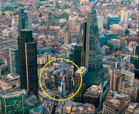
Figure 2: “The Stump”: a new developer became involved. Its two
senior partners were behind the original Broadgate scheme, and
they would bring an enormous amount of experience and
knowledge to the project.
Feasibility
Setting the Criteria
The project commenced by studying the existing design and aiming to make it viable. It quickly became clear that this was not possible. As such, the team embarked on a journey to create a new commercial office building — one that might not look so distinctive, but offer a better return on investment and be far easier to build and, eventually, let.
One of the most important aspects in designing tall commercial buildings is finding a way to make actual lettable office space as high a percentage of the overall available space as possible. There should be usable space and good levels of daylight on every floor.
In all tall buildings, the ratio between the total available area of a floorplate and the actual usable area that can be let are considered. In the U.K., we refer to net internal area (NIA) and gross internal area (GIA).[1] In very simple terms, a net-to-gross ratio of at least 70%-75% is seen as relatively efficient. Square and rectangular shapes are most efficient and are easier, simpler and, therefore, less expensive to build.
Once an architectural study has been done, the first consideration is the form and height of a tall building. One must determine the parameters to which one can push, looking at how much of the site can be filled. With the building itself, emphasis is on setting the footprint and then determining how efficient VT consultants can make its core compared to the external envelope, given its target height. Most core space in tall buildings is taken up by lifts and their lobbies. As such, a challenge from developers and, especially, architects, to reduce lift-core volume is always present. Often, finding a “sweet spot” in VT strategy will set the building’s height, so working closely with the developer and architect is fundamental to outcome.
In this case, the professional design team would receive no fees unless the building progressed through the feasibility stage, and the funders were happy with the results, allowing the project to proceed to the design and planning/application stages. If planning permission could be obtained, odds were very high the tower would be built. This provided incentive to optimize design.
Developers and funders required that specific criteria be met:
- A population density on every office floor of one person per 8 m2 (one to eight) calculated from NIA
- An 80% floor utilization factor
- Compliance with performance recommendations of the British Council for Offices (BCO) Guide to Specification 2009 (and, later, 2014)[2 & 3]
- Ability to board a lift in the main lobby and travel directly to one’s floor — considered essential in the London market
- A height of 309.6 m, the ceiling imposed by the Civil Aviation Authority (CAA), which is set by aircraft flight paths
At approximately 100 X 40 m, the overall site is large compared to others in the city. This enabled large floorplates and, as such, necessitated transporting large groups during peak periods. It immediately became evident that single-deck lifts would be unable to transport such groups without taking up too much core space, which would make the building unviable.
Alternatives considered were:
- Sky lobbies
- Double-deck (DD) elevators[4]
- Two independent lifts in one shaft with a common machine room
While sky-lobby solutions are efficient in terms of core space, they fail to fulfill one of the main criteria demanded in the City of London: a passenger must be able to travel directly to their floor from the main lobby without changing lifts. This is a requirement of tenants, leasing agents and developers alike.
The developer and funders were not happy about being restricted to a single manufacturer (of two independent lifts in one shaft with a common machine room) to deliver what would become the largest lift and escalator contract ever placed in a commercial building in the U.K. There was too much risk. As such, it was decided to concentrate — for the most part — on DD solutions.
DD lifts are not perfect, as there are several design restrictions brought about by their fixed nature. However, after seeing analyses of the various systems that looked at pros and cons, the client decided to commit to this strategy for all main elevator groups serving office floors. From time to time, this would be challenged and other options reconsidered, but it always came back to DD.
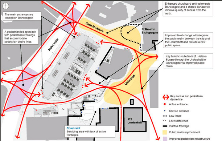
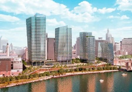
The new building would have major entrances on the north facing the Liverpool Street London Tube station, on the south facing London Bridge and on the east toward the Fenchurch Street stations (Figure 3). The Bank and Aldgate stations are also within close proximity to the western side of the building. Additionally, there needed to be an entrance on the side opposite Bishopsgate, where the tower faces the Aviva Building and 122 Leadenhall on a street known as Undershaft.
About This Piece
This article discusses the various stages of creating 22 Bishopsgate, at 278 m tall and 120,000 m2 one of the tallest and largest buildings in the City of London. The area around Bishopsgate and Leadenhall is a central hub for the insurance and legal professions in the city. Over the past 10 years, it has seen substantial growth in commercial tall buildings. The development was once known as “The Pinnacle,” and had aspirations of being the tallest building in the City. It was properly known as “Helter-Skelter” due to its articulated top. For various reasons, including being overly ambitious, inefficient and poorly funded, the development failed.
A number of attempts were made to bring the project back to life. The current professional team was able to put together a scheme that was far more appealing and responded to the reasons the original scheme foundered. A feasibility study for a 309-m-tall commercial building was commissioned. As with most large projects, there was extensive discussion looking at new ideas and how they affected the core, as well as the height and efficiency, of the building. It was crucial that the vertical-transportation strategy be developed at an early stage, as the height and efficiency of the building would be materially affected by its design. This article describes the journey through the entire design process, from concept to delivery.
Creating Rules
It is necessary to create a set of rules that are adhered to throughout the design process so the funder, developer and wider team understand the engagement. The way buildings are being occupied is changing, especially in the current office environment. Most occupiers — including law firms, insurance companies and banks — in major capitals do not simply place people at desks on office floors; they have breakout areas, meeting rooms, cafés and informal areas throughout their space. They might also have floors for gyms, childcare centers, stores, restaurants, auditoriums and many other uses.
The challenge VT consultants face is how to design for such uses prior to a tenant signing a lease, which, in a speculative building such as 22 Bishopsgate, would not be until after construction was well underway. This is why the one-to-eight density of occupation was used by the developer on every floor. In a building of this size, developers are convinced that not everyone will occupy to that density (more like an average of one to 10). As such, the one-to-eight ratio became their buffer.
Occupational density has become a talking point in the City of London ever since the owners of a major dockland development to the east became involved with 20 Fenchurch Street. The chairman of this development had never included DD lifts in his buildings, and he wanted a buffer to ensure there would be no performance issues. So, it was designed to a density of one to eight on each floor. The building was marketed as such, and, ever since, there has been competition among developers and letting agents to match or better that.
There is always a fight for space in any building within the city core, so the pressure is on to keep the number of lifts to the minimum necessary to meet recommended performance targets. Target wait and journey times are very important measures of performance. Arrival rates and handling capacities needed to provide a high quality of performance are also recommended by the BCO and Chartered Institution of Building Services Engineers (CIBSE) guides.[3 & 5] These are now more clear
(compared to earlier BCO guides), as they include traffic profiles for commercial office buildings.
It was clear that a destination-dispatch system would have to be used, since the only way to make DD work in local groups with mixed traffic conditions[4] is with this type of system. According to the BCO Guide to Specification 2014:[3]
- “Lifts should target an up-peak average wait time (AWT) across all floors served of no more than 25 s. AWT of up to 30 s may be acceptable in cases where the average time to destination (ATTD) is 80 s or less.
- “Lifts should target an up-peak ATTD across all floors served of no more than 90 s. ATTD of up to 110 s may be acceptable where the morning up-peak AWT is less than 25 s.”
After discussions with the developer, it was decided to target a 30-s AWT and 80-s ATTD. Considering this was a tall building with high density, journey time could be extended a little to make things work, since people can see what to expect. This became another rule to work toward to produce results for each scheme.
This approach pushed limits and left no room for flexibility if, for example, a tenant wanted to “over occupy” at a greater density. A simulation tool was used to carry out traffic studies.
Professionals have learned how to benchmark results against those of the major lift manufacturers to grasp if there will be any surprises further down the line. This is a dynamic process and works well. So, the settings used for it are very important. It was equally important the settings be consistent through the design period.
There were many variations on the scheme, as the top half of the building also went through various changes aimed at meeting planners’ requirements. These included schemes affectionately named as “Tub Top,” “Glass Top,” “Magic Carpet” and others.
Optimization
In searching for the optimum scheme to satisfy not only the investors and developers, but also city planners, English heritage organizations and all the other institutional bodies that tend to get involved and have a lot of influence, an exhaustive number of options was reviewed over 18 months.
Office floors started off with floorplates with an estimated 1,500 m2 of NIA. This was for a scheme called “Interlocking,” which referred to the architectural form of the building and was aimed at reusing as much of the existing basement and core as possible. Costs to demolish the basement and core would have been enormous, so, at first, this appeared to make sense since it preserved the basement and core and would have resulted in cost savings. The resultant building, however, was relatively small, and the team knew there would be more complications if demolishing the entire core and modifying the basement floors to a greater extent were considered.
A public right-of-way across the southern end of the site also needed to be maintained. In the “Helter-Skelter” scheme, escalators were used to transport people up and over this thoroughfare. This meant the journey to the lifts was very truncated.
Similar concepts continued to be weighed over the next few months. These included “Carved Rectangle” and “Refined Carved Rectangle,” where the main groups of lifts would effectively start from level two of the building. There were many variations on the scheme, as the top half of the building also went through various changes aimed at meeting planners’ requirements. These included schemes affectionately named as “Tub Top,” “Glass Top,” “Magic Carpet” and others.
Escalators serving a lobby 15 m above street level were considered, then shuttle lifts traveling up to a lobby at level eight, like at the 200 West Street building, were reviewed. From a VT point of view, the latter concept has advantages, as it allows for large, uninterrupted floorplates beneath the lobby.
Often, finding a “sweet spot” in VT strategy will set the building’s height, so working closely with the developer and architect is fundamental to outcome.
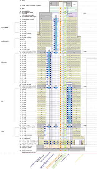
There were, however, expensive structural issues. The lift core is often a major structural support for the building, and, in this case, most of it below level eight was being removed for what was going to be a very tall building. The next scheme became known as “Universal” and had larger floorplates of 2,000 m2 NIA (Figure 4). In this scheme, escalators serving from street level to a main lobby at level two, mezzanine and level three were retained. This iteration included a group of four low-rise DD lifts, eight low-/mid-rise DD lifts and six mid-/high-rise DD lifts. In this approach, however, the journey into the building was thought overly complicated. It was decided that the main entrance lobby should be at ground level.
In December 2013, a concept report was created based on this scheme. However, over the next year, many more variants were worked up, including ones known as “Moonraker,”
“Refined,” “49.15,” etc., eventually coming to the basis of the scheme now being built. The floorplates had grown to 2,500 m2 up to level 30, 2,100 m2 to level 42 and 1,800 m2 to level 54. The lobby was now at street level.
Twelve different lift configurations were considered in the final month before obtaining agreement from the funders to proceed with designing and building what would be the largest speculative office building ever constructed in London and home to potentially 12,000 people. Agreement was reached with the funders. At the beginning of 2014, the project became reality.
Schematic and Detailed Design
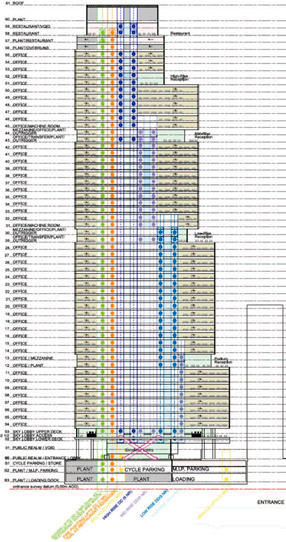
Unlike just about every other design project, the traditional eight Royal Institute of British Architects design stages were fused together and rolled into one. Continual refinement was ongoing. Through 2014 and 2015, more options were evaluated as the architectural, structural and services solutions were refined. The basis of the scheme remained the same. However, it was not until June 2016 that the final configuration was settled upon (Figure 5).
Over time, in discussions with not only the planners, but also the general contractor originally appointed on “Helter-Skelter,” the final height of the building had been set. It was not only a planning issue, but also a buildability issue. At this time, cranes would not be allowed to break above the 309.6-m ceiling demanded by the CAA. This has always been the limiting factor for London’s high-rise development.
The VT scheme that was settled on had now been centered around three groups of eight 2000-kg (26-person) DD lifts. They fit the core and, especially, the width of the building well. However, they alone would not help get the building as high as desired. The lower seven floors of the building above ground were treated differently by using a group of three 2000-kg
Twelve different lift configurations were considered in the final month before obtaining agreement from the funders to proceed with designing and building what would be the largest speculative office building ever constructed in London and home to potentially 12,000 people.
(26-person) single-deck lifts. This enabled office floors as high as level 57 to be reached via the high-rise 2000-kg (26-person) DD lifts.[6] These three lifts were added to the north end of the core, close to the north entrance.
While the basis was set, many other areas of the building had to be designed, including the goods lift; viewing gallery; restaurant; parking and spaces for 2,400 bicycles in the basements; and, eventually, the amenity spaces.
Goods Lifts
There is no other commercial office building of this size in London, and, as such, designing the goods lifts could not be compared to anything else. Goods lift design is not well documented in design guides such as BCO and CIBSE.[7] Many hours were invested in touring other towers in London, speaking to the building managers and considering the strengths and weaknesses of each design. Generally speaking, the other tall buildings in London might have had two goods lifts as their main artery. Some buildings had only one lift serving the top floors. In this case, there would be no redundancy. In this type of high-quality office building, service personnel cannot use the passenger lifts, as they are too busy at peak times and cannot risk being damaged.
Three 3500-kg goods lifts serving every floor of the building were settled upon. Initially, this was successful. But, as the top of the building developed, the space requirements for mechanical and electrical systems, the viewing gallery and restaurant meant that, at the top, not all the lifts were able to serve all of those floors. This was not ideal and meant special buttons on the floors would be required to call particular lifts to particular floors.
Originally, the electrical design demanded five large generators be deployed at the top of the building. They were too large to fit inside a normal goods lift. After much negotiating and discussion, the electrical engineers were persuaded to switch to six smaller generators. It was still necessary to overload one of the goods lifts to carry 7400 kg, on a special operation to carry one of the generators. These lifts are also fast — 4 m/s — to provide a good level of service.
Viewing Gallery and Restaurant
These floors are effectively owned and operated by a separate entity. The original design was centered around maximizing the space to accommodate as many people as possible and churn them through as often as possible, as the experience was going to be chargeable. The views were going to be the best in the city, uninterrupted for 360˚. The most efficient way to move as many people as possible to and from those floors was assessed. There are four levels in all, served by a number of local lifts, and these were to be fed by two 2250-kg (30-person) DD lifts capable of moving more than 800 people per hour.
In the end, City of London planners changed their policy, insisting that all such viewing galleries in central London must provide free access to the general public. This diminished the moneymaking potential. The level of service had already been committed to the owner, however, so that is how it remains. The two viewing gallery lifts are high-speed shuttles traveling at 8 m/s. The top deck of one also functions as a firefighting lift, serving all floors from ground and above via the rear entrance. Both lifts have front and rear entrances to maximize and simplify traffic flow like the lifts in some of the deeper London Underground stations.
The viewing gallery has its own entrance to the south of the building traversing Art Street. Access lifts are provided to an upper level, where escalators are taken to the appropriate deck, whether one is traveling to the viewing gallery or restaurants/reception level. Stairs and lifts are accessed via a separate, dedicated exit. All these lifts and escalators will effectively be in use 20 hr a day. This will place pressure on maintenance crews.
Basements
There are four basements and an additional basement to gain access to the 2.5-m-deep lift pits of the high-speed units. Providing this access was expensive, but necessary.
Within the basement, there are more than 2,400 bicycle spaces, showers, associated changing facilities and the loading bay.
As this area was being developed, it was clear the main lifts could not serve down to the basements, due to the massive disruption this would cause to lift service. It was quickly agreed that a separate group of lifts be used to link the basements to the lobby. There would potentially be a lot of traffic going to and from the basement during peak times.
The loading bay is served by two 26,000-kg hydraulic lorry lifts. These are enormous and very specialized. They must be very reliable, as they will be used intensively for periods during the day, especially mornings. The number of lorries is reduced by using a consolidation center outside of London, but there will still be substantial movement when 12,000 people are involved. There is a separate firefighting strategy for the basements. It is served by two dedicated firefighting lifts within the associated firefighting cores.
Additional Challenges
The whole site is on a slope with around a 1-m difference from one end of the core to the other. As DD lifts were employed, it was imperative the floor-to-floor heights remain even through the whole building, so a series of gentle ramps were employed to even them.
Due to the depth of the floorplates, the floor-to-floor heights needed to be taller on the lower floors so the floor-to-ceiling heights could be increased to allow in more light. All these variations had to be taken into account and agreed upon by the architects and developers.
Another firefighting lift was required in the main core, but there was no room. Therefore, the same principle as for the viewing-gallery lift was used, and, again, an upper deck of one of the high-rise lifts with a rear entrance opening into the firefighting core was used. While this might have compromised the design of one of the main DD lifts, it saved substantial core area. These principles were all agreed upon with City of London planning authorities, who had been very supportive throughout.
As the design continued to develop, it was essential that a theme for the building be determined. This ended up being “art.” A public thoroughfare was given the name “Thoroughfare of Art Street,” and a large amount of artwork will be displayed in such areas as the main entrance lobby and in the lifts themselves.
The reception area will include a library and use leather and wood extensively. Lastly (and late in the design process), it was decided to use level two as an enormous amenity space. This would serve the whole building and shape the design of the main-entrance lobby. Only the three single-deck lifts at the north end of the core were designed to serve this level, and there is no interconnectivity with the rest of the building. Due to the fact the DD lifts had been designed close to the limit, there was no way they could be allowed to stop at level two. It was also a single level, so a “two stop” of the lifts would have been necessary, which would add confusion and take far too long. Therefore, an alternative had to be found.
A combination of escalators and lifts was chosen. The lifts serving the basement were to be extended at the south end of the core up to level two and increase their number to three.
The escalators in the main lobby area serving the upper deck of the main groups would be extended up to serve level two. This would provide a compromise, as the occupiers would have to change lifts, or transfer from lift to escalator, to travel to and from level two. Nonetheless, this would work well.
References
[1] Royal Institution of Chartered Surveyors (RICS). Code of measuring practice, 6th edition. RICS, London (2015).
[2] BCO Guide to Specification 2009.
[3] BCO Guide to Specification 2014.
[4] J.W. Fortune. “Modern Double-Deck Elevator Applications and Theory,” ELEVATOR WORLD, August 1996, p. 63-68.
[5] CIBSE Guide D: Transportation Systems in Buildings 2015.
[6] EN 81-20 Lifts for the transport of persons and goods – Part 1: Safety requirements for passenger and goods passenger lifts.
[7] L. Halsey, “Goods Lifts, Who Needs Them?”, Proceedings of 9th Symposium on Lift and Escalator Technologies, Northampton (2018).
Get more of Elevator World. Sign up for our free e-newsletter.
